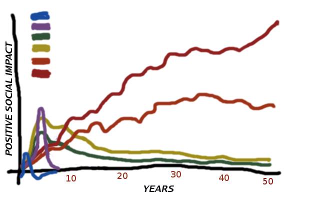
Some months ago, I attempted to conceptualize, in data-visualized form although still a kernel, of what I’ve been trying to jot down as raw notes for a blog piece. But since then, I haven’t had the chance to sit down to complete the piece.

Thus, you people are stuck with the same raw graph I posted last May. I’m sure you are curious as to what the squiggly lines of different colors represent. Let this be a little exercise for interested readers to complete the concept, without my having to launch into treatise mode. Continue reading “Understanding the spectrum of social squiggles”

