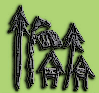
I’ve been considering several variations on the central theme of rivers and indigenous life as the basis for the logo design of this website and the concept underlying it. Late last year, on the spur of an impulse, I dashed off a design study on a sketchpad using a Chinese brush, and did some digital photoshop magic to produce this:

The two letter I’s were shaped that way to signify a pine tree and also a native spear with barbs. I would have wanted a modified shape that could also represent, on top of pine tree and spear, also a pointed quill pen and a torch (like in the NMIN logo). But maybe that’s asking too much for a single design object to represent. Continue reading “The IRAIA logo”

