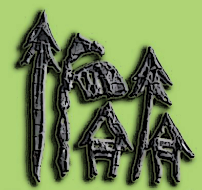
I’ve been considering several variations on the central theme of rivers and indigenous life as the basis for the logo design of this website and the concept underlying it. Late last year, on the spur of an impulse, I dashed off a design study on a sketchpad using a Chinese brush, and did some digital photoshop magic to produce this:

The two letter I’s were shaped that way to signify a pine tree and also a native spear with barbs. I would have wanted a modified shape that could also represent, on top of pine tree and spear, also a pointed quill pen and a torch (like in the NMIN logo). But maybe that’s asking too much for a single design object to represent.
The letter R (in small-case cursive) represents a palm or banana tree. I would also have wanted to modify the shape so it could symbolize a hand scythe or finger scythe cutting a rice talk. Or maybe a flag. But again, it’s probably asking too much symbolic work for a single character to carry.
Finally, the two A’s, which obviously symbolize a house on stilts. Again, I tried (without success) to massage the design so that the A could also symbolize a mountain peak. I’m no OCD design freak, but hey, that’s part of the fun in designing stuff.
I liked this logo design, of course, except that I still wasn’t sure the flat pastel green was a good background. I’m partial to green, but something tells me this isn’t quite the right shade I was looking for. I also wanted to introduce a dash of brown to signify the earth, and a flowing line or two of blue to signify water, for the mythical river that is built right into the name of IRAIA.
No river for now. Maybe I could just do a standard free-flowing three-wavy-line thingie in blue that runs under the IRAIA characters. But I hate to overdesign, and I want to retain the logo’s simplicity. So we’ll see. No rush.
So this won’t probably be my last take on the logo. But it will do for now, until I get hold of that Chinese-brush-and-Photoshop moment again.
Epilogue
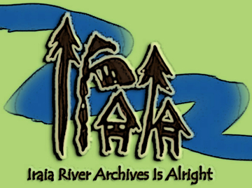
I hada bit of free time to work on the logo again, in a more cartoonish style that would be more apt to serve as badge or thumbnail in social media sites such as Facebook. I added the “wavy-line thingie” as well as the full name behind the acronym.

I’m still undecided whether it should be “…Is All” or “…Is Alright.” But that can wait. F*ck SEO. The world won’t come to an end if I violate SEO axioms now and then.
So here it is, world. The Iraia logo once more, Nickelodeon style.

